While perusing the hallowed website of Amazon for an Edith Wharton book; ”The Age o
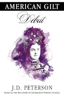 f Innocence”, I’m struck by how many different versions of the novel have been published. Some are revised additions, some have footnotes, but most all present different covers. I find it interesting that traditional publishers frequently change the covers on publications.

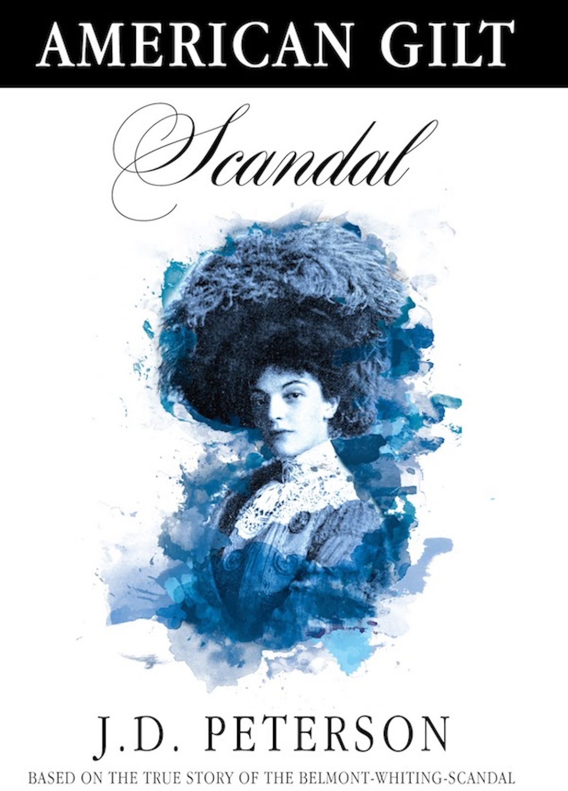
So, taking a note from traditional publishers, I gave serious consideration to the idea of new cover art to accompany a re-launch for the AMERICAN GILT novel trilogy. That is not to say I don’t like the original covers – I do. Very much. All three covers work great together with the use of historical photographs. My graphic designer went for a timeless, classy look, and I think we succeeded in achieving that goal.
But, the bottom line is… well, the bottom line. In spite of the fact that readers love the novels, getting fans to leave a review for future readers is always a struggle – in spite of the fact that those that read book one, go on to read all three books, sometimes in as little as a week’s time. Even with such strong reader loyalty, it can be a challenge to get the word out about the novels.

After much pondering and debate, I decided to move ahead with new covers designs. Part of me feels as though I’m abandoning some aspect of the original publication. A visit to Amazon reminds me that traditional publishers have no problem putting out new versions of books – and if it’s good enough for them, then it is good enough for me!
LOOKS ARE EVERYTHING!
Referencing the idiom “every picture tells a story”, Cambridge dictionary says it is “said when what has really happened in a situation is clear because of the way that someone or something looks.”
Once again I am reminded that in our world, looks are everything! The goal is to catch the eye of new, prospective readers – who are most probably looking at a tiny thumbnail version of the cover. I have been working for several months going through photos and rewriting the cover text. In spite of the countless times I have rewritten the text, I find myself continually exploring different options for the final draft! In addition, I have changed the cover photos several times as well. The project is challenging because it is a trilogy – so artwork, photos, text etc. must be done three times, while remaining cohesive and, most of all, enticing. My small team of trusted helpers are great sounding-boards for ideas and opinions.
 The new covers are shaping up, but not without some original angst regarding the process. Stock photos felt like they were
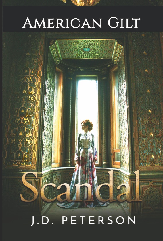
‘cheapening’ a project I had worked long and hard to complete. I had to stop the designer’s work for over a month to reassess my ‘vision’. I’m glad I did because now the project is going much better.
With the experience I gained through the work of the original publication, I’m now making plans for various promotions to re-launch the trilogy. All of this while working on a new novel. (It seems we authors are great at juggling multiple projects at one time!)
Hopefully, the re-launch will be ready in a month – My May 2018. The initial response to those involved in the project has been very positive. Let me know what you think of the new cover designs! I luv hearing back from my readers.
As I work to complete the covers for the trilogy, I look forward to gaining new notice for a true story from the past. And we shall once again reaffirm that readers do indeed judge a book by its cover! – J.D. Peterson